Hello.
I wanted to give some feedback for the Installer Editor on the website.
The first thing I noticed when navigating to the editor was that it looks and feels terrible.
The info box on the right looks out of place, the main element with text boxes all vertically isn’t either nice to use or visually appealing - it requires too much scrolling. The fonts seem a bit too large. The Short box descriptions are nice to have but are always visible which results in the screen being completely filled with text in conjunction with the info box and everything else. Also the fonts are not used consistently. And the gray background color of some boxes also doesn’t look good imo.
Here’s an example I think would be more usable then what is available atm.
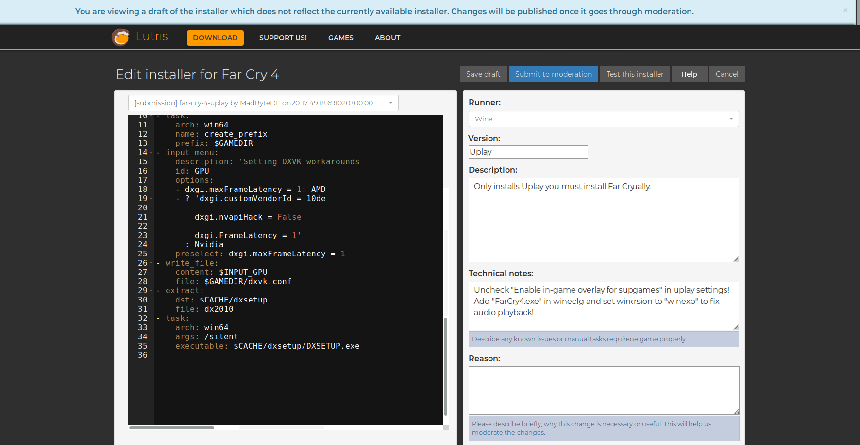
The help button could open the documentation in a small pop-up window instead. If needed both main boxes (Editor and options) could be resizeable to match different resolutions. The short descriptions for the boxes could be reimplemented as tooltips.
Another problem is the visual feedback for user actions like sending a draft / submission. After clicking “Submit to moderation” I wasn’t sure if it worked or not because there was no indication for success.
And last but not least, the “Reason” box doesn’t save its content when creating a Draft or submitting to moderation. It’s not fun to “lose” progress and rewriting text every time.